An Epic Report/Dashboard With Keen.io And Kendo UI DataViz
A while back, I wrote a post on the idea of a minimum viable report – basically, just using simple NodeJS files that I run from the command line and console.log stuff out so that I can see the information I want. This is still working well for me, honestly, and I’m still running two separate reports like this. But not all of the reports that I need are quite this simple – especially when it comes to customer facing reports for SignalLeaf. What I really need is a way to store some event data – data about things that happened, on which I need to build reports and dashboards – and have that displayed in some pretty charts and graphs, with custom labels, etc. The solution ended up being pretty awesome, and uses both Keen.io (which I mentioned in my SaaS of SaaS post) and Kendo UI’s DataViz charts.
Storing And Analyzing The Tracking Data
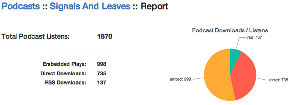
I wanted to produce some beautiful reports for the podcasters that are hosted with SignalLeaf… something that looks like this:
When I first set things up, I took the quick and easy route of storing data for my reports directly in my MongoDB. I knew this wouldn’t get me very far, but it got me started. I was able to put together some uber-simple reports for episode downloads. But it stopped there, and stagnated quickly. Eventually, I started looking at what it would take to build the aggregate reports, to run the math and to the queries out of MongoDB. And as you can guess, I wound up tossing my hands in the air and ignoring analytics and reports for a long time. MongoDB is an awesome document store… but it’s terrible for analytics and reporting. Then along came a recommendation from someone, to check out Keen.io. So I Did. And I immediately saw that this was the solution to my problems for storing data and generating the numbers for the reports that I want.
Frankly, MongoDB isn’t a good solution for reporting. It’s amazing at storage and retrieval, but processing those documents in to meaningful data for analytics requires a ton of code – no thanks. So I choose Keen.io because I can send it whatever data I want and let it do the heavy lifting of crunching the numbers. I tell it what “collection” I want to store it in, run a query against their HTTP API or SDK (in many languages), and I get back the results I want.
All I need is a simple JSON document for the data. For example, when someone downloads an episode of a podcast, I send off JSON that looks like this:
And now I can query a URL that looks like this:
And I get data that looks like this:
Ok, wait a minute. That URL is horribly impossible to build on your own. But don’t worry about it – use the Keen.io workbench to build your queries and it’s all good. It gives you a nice web page that builds out the URL for you and even runs the query and returns the results in a bunch of different formats (including a Keen.io visualization / graph option).
Rendering With Kendo UI DataViz
Keen.io has some charts and graphs that it can render, for you. It’s quite easy with the workbench that Keen provides, giving you the JavaScript SDK code that you need. But there are some limitations in the Keen charting that I don’t necessarily like. You can overcome most of the limitations by writing a lot more code and configuration for the visualization. But I think the real power in Keen is no the graphs, but the JSON API over HTTP, allowing me to use any code I want and any charting library I need – including Kendo UI’s DataViz charts.
In the case of my report, I needed a few things: a sum total of the numbers, display of the individual numbers on the left, and the chart showing the numbers on the right. While I could have generated the chart with a single call to the Keen SDK, I would have had to make more calls to get the same data for the display on the left, and for the total. Rather than doing that, wasting precious network calls to Keen, I wanted to make a single call to the HTTP API and get back the JSON document with the numbers. Then I can use my own JavaScript to insert the numbers on the left, sum them up for the total, and render a Kendo UI DataViz chart on the right.
Using the URL that I showed above, I’m able to get the data that I want with a simple jQuery AJAX call
The showTotals function referenced in the success callback is where I get the numbers for display on the left, including the total at the top. This is a simple function that uses some CSS classes to find the right element for the right number, and also totals up the numbers at the same time.
The fun part here, is that I’m using _.each to loop over the items, get the proper CSS selector and HTML element based on convention from the returned data, and total the numbers in the same loop. Then when the loop is done, I update the totals element with the right number.
The next function called from the success callback of the AJAX request, is the drawChart function. This one, as you can guess from the name, draws the Kendo UI DataViz chart:
When I first wrote this function, I was doing this crazy loop over the data to transform the Keen.io data structure into a structure that Kendo UI would recognize by default. This wasn’t terribly smart, though. Kendo UI provides an easy way to tell the chart what the data structure looks like, using the “field” and “categoryField” settings in the series. Once I updated those to match the actual data structure, I was able to take the looping / transform code out. This greatly reduced the complexity of the code for this function, turning it in to nothing more than configuration for the chart.
The best part about using Kendo UI in this case, though, is that I’m not limited to a pie chart. Keen’s charts would return a pie chart by default, for this data. But with Kendo UI’s charts, I was able to play with a lot of different chart types before settling back in to the pie chart for now.
Keen + DataViz == #WINNING!
In the end, I’m very happy with the results that I’m getting from the combination of Keen.io and Kendo UI DataViz. The combination makes for a super simple way to store data for analytics, run the analytics I need, and create some beautiful charts for the podcasters hosted with SignalLeaf. If you’re looking for customer facing dashboards and analytics charts for your website, you should check out both of these services / products.