Attack of the pseudo-frames
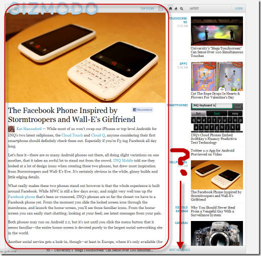
AKA, folks are getting a little too clever in AJAX-land. There was a joke going around when “new twitter” launched that “old twitter” is what Steve Jobs would have designed if his engineers started with “new twitter”. Looking at any of the Gawker family of sites this week, you’d notice a stark change:
Two really strange things going on here. First, the left side of the screen scrolls independent of the right. The right set of that indicates links to articles will stay static. But you can see that one of the articles on the right is cut off halfway through an image. There’s nowhere to scroll to get see the rest of the content. Instead, there’s a silly little link, “Next Headlines” that pushes the content up.
I don’t usually mind this design, as Gmail and Google Reader have used this style for ages. However, they still use normal scrollbars inside a clearly demarcated area that has its own scrolling behavior. In Google Reader, the entire page is fixed, except for a window into your feeds.
Searching some articles on this new design, it turns out that the charlie-foxtrot that is the new Gawker design decided to go all-in into bastardizing URLs with “hash-bang” URLs. So not only is the UX broken, they’ve decided to break how the web fundamentally behaves with URIs. As a comment in that post says, “If site content doesn’t load through curl, it’s broken”.
Web users still have to put up with obnoxious Flash-only restaurant websites, can we all just collectively agree that hash-bang URI, AJAX-only websites are an abomination, a failed experiment, and should be retired to the same pastures as the blink tag?
