Gawker sites breaking the web
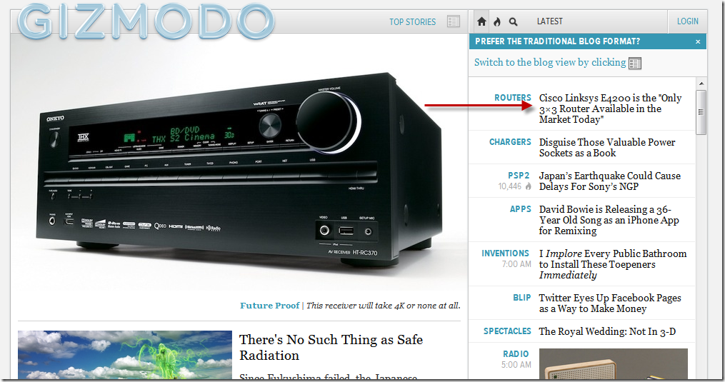
Another baffling feature of the new Gawker sites re-design is that it appears that they’ve broken the browser’s Back button. Starting at http://gizmodo.com, I’ll click a link for an article:
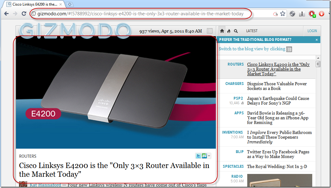
That brings up the Web 3.0 Frames magic and replaces the left frame of the screen:
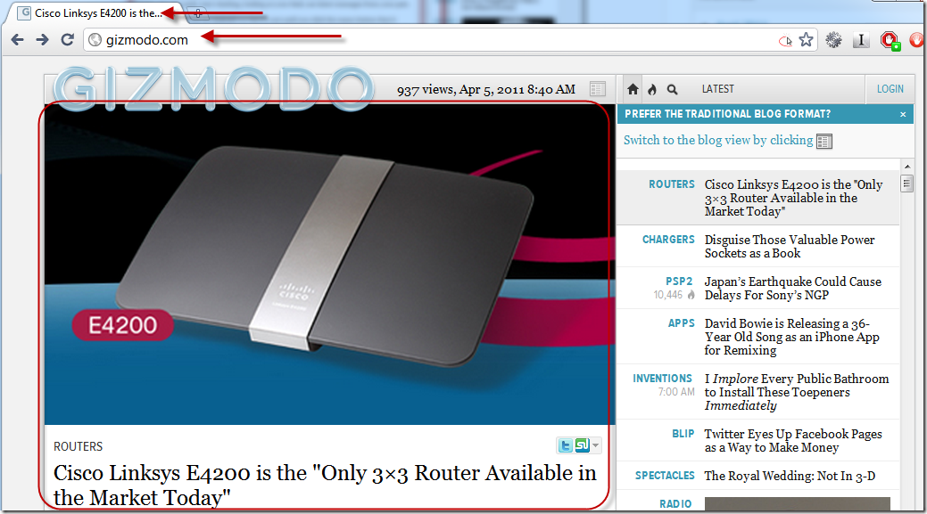
Note the fun “hash-bang” URLs in the address bar. When I click the “Back” button or navigate using the browser’s Back command, the address bar changes but nothing else does:
The title bar and main content stays the same, but the address bar goes back to the home page. Nothing else happens, I don’t get back to the original screen I was on. I suppose I’m intended to use only the in-document navigation?
When I first started doing AJAX applications back in 2004-5 or so, one of the cardinal rules we adhered to was “Don’t break the Back button”. Has this rule changed, or is the Gawker site design really that bad?


