UX: Color is only meaningful if it’s different
Color is important for UX
On the daily, when I’m not lurking imgur, I work on HR case management software. HR case management isn’t exactly the sexiest technology sector, but that doesn’t keep me from trying to provide the best User Experience possible.
Recently I’ve been working on a light switch type control that can use various colors when they are in the active state
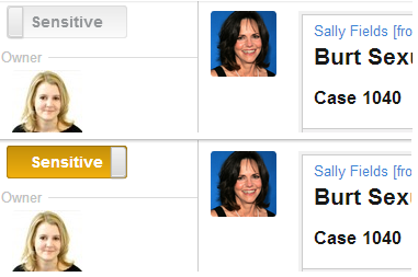
Here’s the toggle color for making a case “Sensitive” in our application. A “Sensitive” case is restricted and can not be seen by users in our public facing application.
Here’s what it looks like in the app on our case page.
The color helps the user see from a glance that this Case is different, because the color isn’t the normal state. That’s the key here, it wouldn’t be special if it was always yellow.
The main purpose of our application is to keep track of the entire conversation over the issue. This mostly consists of comments and emails between the employee and their HR rep.
Notice here that I used the same control and color for toggling comments. If the HR rep doesn’t want a comment or an email to be seen by the employee they can set it to Internal. The logs are created as public so the color is meaningful because it’s different.
Some customers want every log (comment, email, ect.) to be internal by default, so we have a setting they can configure that will create all of the logs as internal. This changes the meaning of the color, if everything is internal by default then the yellow color is no longer special it’s not different so it’s no longer meaningful.
When that happens the control changes to “Public” and the color changes from a warning color to a primary color.
Color is great in an application, but it’s only meaningful if it stands out from what’s normal in your application.
Keep herpin` while you’re derpin`
-Ryan


